10. Oceans Ate Alaska - Lost Isles
Couldn't find any interesting information about this piece, sorry guys. It's a jellyfish, tho, so that's pretty cool. It does look a bit phallic from a distance now that you mention it, thanks pervert.
09. Matt Nathanson - Show Me Your Fangs
Angela Deane has this creepy thing she likes to do, where she paints over existing photos, almost erasing human beings with White-Out, turning them into ghosts. Seriously, she does this all time, look, it’s the type of project I'd imagine serial killers to partake in. That said, it is fucking rad, and Matt Nathanson thought so too, as he accidentally stumbled upon Angela’s work on tumblr and hired her immediately to make his record cover. I wish I was a serial killer, I'd probably make more money.
08. Butcher Babies - Take It Like a Man
This band is generic nü-metalcore at best, but I do appreciate the seemingly paradoxical approach that follows them around. In a decidedly testosterone filled genre, this band is fronted by two ladies. And yet despite all the blood and murder and horror and ugliness they scream about, they are incredibly sexy in an almost typical alternative cheerleader type of way. But then in the midst of all this prominent female confrontation, they called their album Take it Like a Man. Except they put a little girl in an innocent pink dress on the cover. Except the girl is wearing a viking helmet. And they are called Butcher Babies. Deep.
07. Ghost Bath - Moonlover
There are multiple reasons as to why above artwork should not be on this list. First of all, it’s a complete cheat, as this image is nothing more than a stolen 1957 art piece from postmodern Guatemalan photographer Luis González Palma, titled La Luna. Second of all, the band is often accused of ripping everything they know from Deafheaven, including their sound and even this image, which does look suspiciously similar to one of the Sunbather tour posters. And finally, it’s kind of a cliché idea at the end of the day: a moody black and white topless women style, ooooh, scary and profound. However, boobs and moons and stuff, so here we are.
06. Strange Wilds - Subjective Concepts
For a lead singer of one complete Nirvana rip-off band, Steven Serna sure likes to talk a lot. Thankfully for me, this means I don't have to say anything. Take it away, Steven: “I went to walk along a concrete curb (...) and while I was balancing I suddenly had this thought of what if this was the edge of a tall building. And then right after that thought I was like ‘Dang, that could be a cool record cover’. (...) The picture was taken by photographer David Belisle (...) [he’s] done a lot of photos of R.E.M. and the Yeah Yeah Yeahs, so it was a real treat that he wanted to work with us (...) some people have expressed they feel uneasy looking at [the cover art], and that is kind of what we were going for. That sense of standing on the edge, or even more so running along the edge and losing balance (...) everything we’ve been getting into by signing to Sub Pop is brand new territory to us and it can feel like walking on the edge sometimes. As cheesy as that sounds.”Yup, sounds pretty cheesy, but it looks great.

05. Sulphur Aeon - Gateway to the Antisphere
After Ola Larsson provided such incredibly impressive artwork for Sulphur Aeon’s debut album, it only made sense for the band to continue paying moneys to keep his imaginative creations on their side. And, damn, isn't this some exceptional art right here. What’s even cooler, is that Ola was kind enough to share the whole process with his fans on Facebook, starting from a rough sketch supplied by the band, right until his masterpiece was complete. It’s no wonder, then, that the group stated “there’s a whole bunch of talented artists, but we think Ola is the one artist for us”. Bless!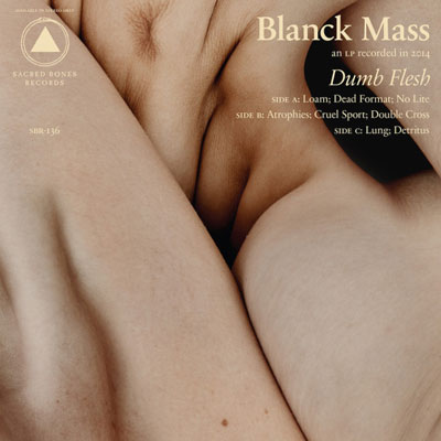
04. Blanck Mass - Dumb Flesh
When you want an image which is as perfect as your title, who do you turn to? You turn to Alex de Mora. When you want an artist who has done portraits for some of the biggest names in hipster music (such as Purity Ring, Eagles of Death Metal, MF DOOM, Arctic Monkeys) and cultural history (Hulk Hogan, The actual Queen), who do you turn to? You turn to Alex de Mora. When you want an image made out of body parts but in a creepy, uncertain, illogical way, who do you turn to? Well, to be fair, you should probably turn to Chris Cunningham. But Alex de Mora did a good job as well. Costs less too, I'd imagine.
03. Marika Hackman - We Slept at Last
“The artwork’s always important to me, with any record. With this, I saw that image by Glen Erler—the girl on the bed, the cover art—and he’s been one of my favourite photographers for the last five years. I was like, ‘I’ve got to have that picture’. I hate naming things but as soon as I saw that, I knew to call the album We Slept At Last. It was the first thing that jumped out at me, it hit me right in the core.”Same.

02. Pyramids - A Northern Meadow
This group has a decent reputation for album covers (see their debut, it’s even better) and so there may have been a little bit of pressure on photographer Scout Pare Phillips to deliver an a-grade product. Although, probably not really, because he once shot a music video for Jack White, and who are Pyramids anyway? Whatever, I reeeeally want to stick my hair against the wall right now.![The 10 Worst Album Cover Artworks of 2014: 01. Dilly Dally - Desire [Single]](https://blogger.googleusercontent.com/img/b/R29vZ2xl/AVvXsEgRgoihKYzSocM7Fq52bJZD8rnheNhdx5PwTOEC-Nzatxn6Vshgc-tmALHXFQFQJ5hlDmRQKhOAUmIwWsXBJDw93rwnwdaB04gpv_DfRAMAq1kUQdDpWdOYJYjOCCmJsGHWOkC8Ys757Ys/s1600/15Nov25_Best-Album-Artwork-2015_Dilly-Dally-Desire.jpg)
01. Dilly Dally - Desire [Single]
In order to fully understand this Donovan Brien image, one must first admire the cover for Dilly Dally’s debut album, Sore. According to lead vocalist Katie Monks, she had a “vision. The oversized hunk of jewelry on a girls tongue. Pink glossy lips. Almost like a make-up commercial gone wrong. Very empowering, and sexy to me. I knew it had to be the cover of our album.” From this, I deduce the above Desire art to be the sequel of that idea, as this injured tongue has met the ice cream and left its bloody mark. Furthermore, the image for their second single Purple Rage is a continuation of this story, as the eager mouth could not help itself, and an even worse mess has infected the cone. This is all presumption, of course, I could be wrong. Either way, a bloody ice cream is pretty (and) hardcore.Five Other Brilliants
Faith Healer - Cosmic Troubles
Kendrick Lamar - To Pimp a Butterfly
Purity Ring - Another Eternity
Petite Noir - La Vie Est Belle / Life Is Beautiful
Stealing Sheep - Not Real
The 10 Worst Album Cover Artworks of 2014
exists too...